|
|
Post by Evil Jester on Aug 23, 2012 13:05:04 GMT -6
|
|
|
|
Post by Evil Jester on Aug 23, 2012 13:12:48 GMT -6
|
|
Deleted
Deleted Member
Posts: 0
|
Post by Deleted on Aug 23, 2012 13:54:26 GMT -6
That would be cool but I don't have enofe room for the number of kills I got in game...7 556 destroyed......LOL also it would be hard to keep up todate I get a least 1 kill a match on average....
|
|
Deleted
Deleted Member
Posts: 0
|
Post by Deleted on Aug 23, 2012 13:57:00 GMT -6
Yes last night I tweeked a transparent one myself and put it on the WoT with fingers crossed, I didn't fatten the shield I left it origional so i knew it would be a bit slim sized down like that.
|
|
|
|
Post by {ICM} Pete on Aug 25, 2012 23:27:15 GMT -6
Here's my siggy. I only spent about 45 minutes on it.  I was going to go throw it into the beginner competition of the week for fun... but I don't think mine is up to par with the other guys. I would have to spend more time on something else. 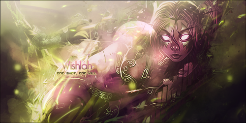 This is the "beginner" competition section on the site. Funny, huh? |
|
|
|
Post by {ICM} Bob Fire on Aug 26, 2012 6:21:54 GMT -6
|
|
|
|
Post by Evil Jester on Aug 26, 2012 10:36:58 GMT -6
Hm, It looks like that "beginners" image has about 2 main deflection type perception images within the base layer. More misconception than image direction. Makes you look at it from a few broad ranges of who would see what when looking at it. Persons are different, and the perception would be the same (In the artist attempt). Their are minor edging details that are off slightly. It's just like blaring a unique sound into a room to invoke a emotion response to change a view on a 'Adjective principal. In this case it's more a visual response. I can see this stuff, explaining it has never been a strong point of mine. It is like the artist is trying to mix in a large range of similarities on view. (I've cut out some explanation on this -the details shortened opinion overall). It's the sort of thing you could go on and on about. lol
|
|
|
|
Post by {ICM} Pete on Aug 26, 2012 12:12:42 GMT -6
Thank you, Bob.  The one that says bl0nde is mine. The one below it is someone I would be in competition with. It all comes down to voting and simply who likes what more. It's for fun. I'm not sure which signature you are talking about, "Their are minor edging details that are off slightly" I think you're talking about wishlah's sig. It also sounds like you could make a better one. Care to walk the walk and show your skills Mr. Jester? Just curious. "lol" |
|
|
|
Post by Evil Jester on Aug 26, 2012 15:08:32 GMT -6
|
|
|
|
Post by {ICM} Pete on Aug 26, 2012 16:12:36 GMT -6
yep
|
|
|
|
Post by Evil Jester on Aug 26, 2012 17:26:42 GMT -6
could have reduced layer and over tuned a bit. but this is a direct drag and drop then minor edit. No dither, no transparency, or image interlinking done. This is basically a clear vinyl under a cut out of another image.
|
|
|
|
Post by {ICM} Pete on Aug 29, 2012 20:14:59 GMT -6
|
|
|
|
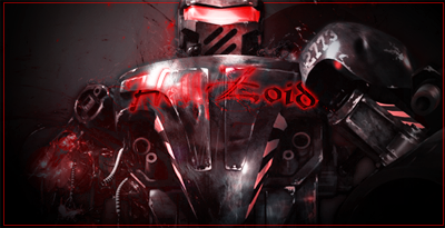
Post by Hellzoid on Sept 3, 2012 22:59:50 GMT -6
Hey Valere! got a challenge for you! can you do me a sig.? what i want is a black knight looking like it just walked out of the depths of hell! lol thats if you want to.
|
|
|
|
Post by {ICM} Pete on Sept 3, 2012 23:22:43 GMT -6
Sure.
|
|
|
|
Post by Hellzoid on Sept 3, 2012 23:57:32 GMT -6
thanks
|
|